
Understanding Your Training Load: Beyond the 10% Rule
When training one of the key questions is "how much training is enough" to build fitness without going too far and risking injury or burnout.
Almost all runners will have heard of the 10% rule, ask the question in almost any social media or in-person running group "how much more should I run next week?" and more often than not the advice offered will be "increase by no more than 10% a week".
While the 10% rule can be a decent starting point for a novice, it's a very blunt instrument. It doesn't account for workout intensity, or your individual capacity for adaptation. In short, it's not a model that is truly "informed by science". Fortunately, modern training platforms and wearable technology have given us access to more sophisticated, data-driven models that can help us make smarter decisions.
Most of us now use wearables that track our workouts and store the information on a central platform or share the data to platforms such as Strava. In most cases this data is then used to produce performance charts using variations of the Fitness-Fatigue Model, often also showing the Acute:Chronic Workload Ratio (ACWR).
These are some of the key metrics I use as a running coach to guide the volume of training I prescribe to my athletes, and you can use them to!
The Heart of It All: What is Training Load?
In simple terms, training load is a numerical score that quantifies the total physiological stress of a single workout. It's a way of turning a run, a bike ride, or any other workout into a single, comparable number.
Think about a 60-minute easy run versus a 20-minute all-out sprint session. The easy run is longer, but the sprint session feels much harder. A simple time or distance metric doesn't capture this difference in effort. Training load, however, does. It combines the duration and intensity of an activity to give you a more accurate picture of the stress placed on your body.
Platforms and coaches use different methods to calculate this score, but they all serve the same purpose. Here are two (technically more) common, research-backed approaches:
- Training Stress Score (TSS): There are variations of this metric, for example the platform I use (Training Tilt) uses Effort Score (ES) while other platforms may use Training Impulse (TRIMP). I won't go into the specifics of each type here but simply put they combine the duration and the intensity of a workout to measure how hard a workout is relative to the athletes fitness, typically allocating a score out of 100.
- Session-RPE (Rating of Perceived Exertion): This is a simple, subjective, but highly effective method that requires no special equipment. You multiply the duration of your workout (in minutes) by your own perceived effort on a scale (typically 1-10) to get a training load score. This method has been shown in peer-reviewed research to be a valid and reliable way to quantify training load, and it has the added benefit of incorporating the athlete's own experience into the data. You can find out more about RPE in my blog post : Effort perception in Running.
An important detail to note, particularly when predicting training load is that some software applies an Intensity Factor (IF) that adjusts the training load score to account for the unique demands of different activities. For example, a trail run's pace might be slower than a road run, but the physiological load could be higher due to elevation gain and technical terrain. By adjusting the score based on factors like elevation and pace variability, the software provides a more accurate representation of the true stress on your body.
Regardless of whether you are using software completing detailed calculations or calculating it yourself using RPE and duration, the key takeaway is that every workout has a quantifiable "load." These daily scores are what fuel the more advanced metrics we see on the charts—Fitness, Fatigue, and Form.
The Basics: Fitness, Fatigue, and Form
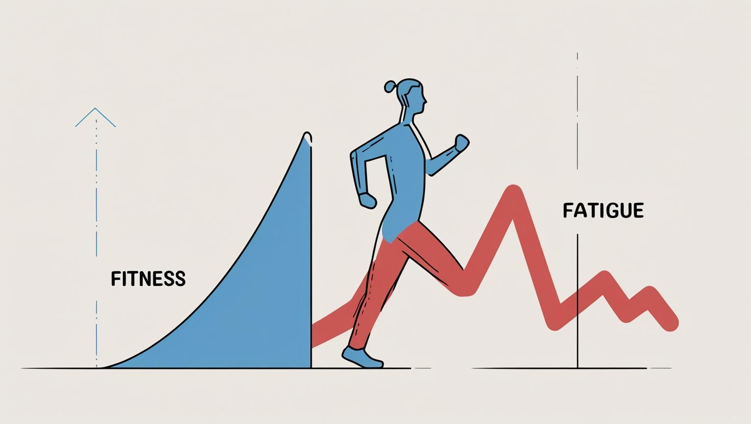
The model behind these charts is the "Fitness-Fatigue Model" developed by Dr. Eric Banister in the 1970s. It proposes that any training session creates two distinct and opposing effects: Fitness & Fatigue
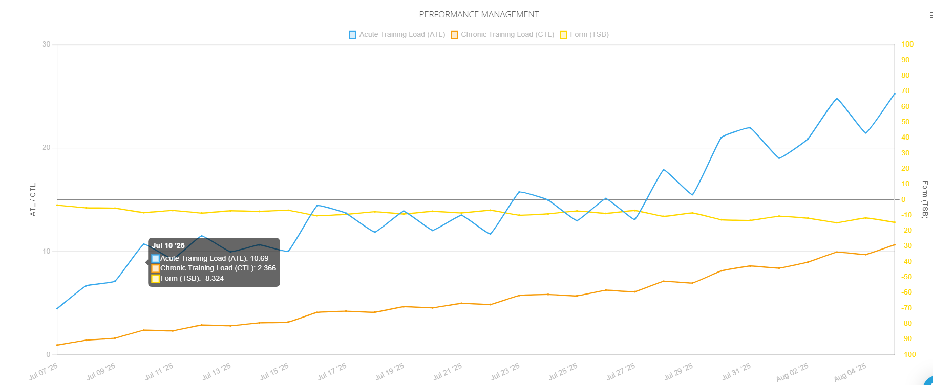
Fitness (Chronic Training Load or CTL): The Orange Line
- What it is: This line represents your long-term, accumulated training load. Think of it as your body's base level of conditioning and endurance. It's the result of consistent training over a longer period, typically calculated as a weighted average of your training load. I'll explain what "weighted" means in the more advanced section below, but for now, just know that it reflects your body's long-term response to the cumulative stress of your training.
- What it shows: A steady upward trend in this line indicates that you are consistently training and building your overall fitness, some dips are to be expected as you take recovery weeks but overall we are aiming for it to increase over time. It's a key metric for gauging your long-term progress. Note that different platforms use different time constants for this calculation, with 42 days (six weeks) being the standard in many models (like TrainingPeaks), while others may use a 28-day window.
Fatigue (Acute Training Load or ATL): The Blue Line
- What it is: This line represents your short-term training load and the physical exhaustion from recent workouts. It's the immediate effect of your training. It's typically calculated as a weighted average of your training load over the last 7 days.
- What it shows: This line rises sharply after hard workouts and falls quickly with rest. A high fatigue score means you are currently tired, and your body is in the process of adapting to the training stress.
Form (Training Stress Balance or TSB): The Yellow Line
- What it is: Form is the key to it all. It represents the balance between your Fitness and your Fatigue. It's a simple calculation: Form = Fitness - Fatigue.
- What it shows:
- Negative Form: When you are training hard, your fatigue (ATL) is higher than your fitness (CTL), resulting in a negative form score. This is normal and necessary during a building phase. It means you are challenging your body to adapt.
- Positive Form: When you rest or taper, your fatigue drops faster than your fitness, causing your form to move into positive territory. This indicates that your body has recovered, adapted to the training, and is now ready to perform. Your goal is to have a positive form score on race day, typically suggested to be around 5 to 25 but the ideal score is very individual.
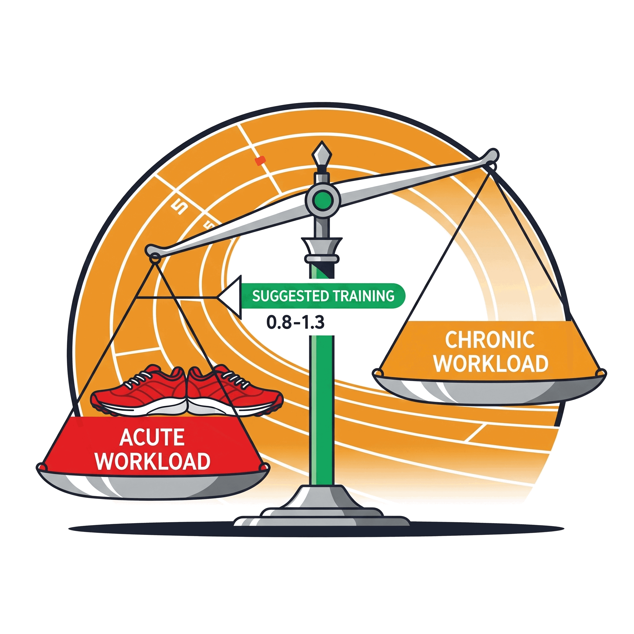
ACWR: A Smarter Way to Manage Training Load
The ACWR is a more dynamic way of thinking about the Fitness and Fatigue lines. In its simplest form, it's a ratio that compares your short-term workload (your Acute Training Load over 7 days) to your long-term workload (your Chronic Training Load).
- ACWR = Acute Workload (last 7 days) / Chronic Workload (last 28 or 42 days)
This ratio gives you a more precise measure of how well your body is prepared for its current workload. Peer-reviewed research, particularly in team sports, has shown a strong link between a high ACWR and an increased risk of injury. The recommended range for progression and injury prevention is generally considered to be an ACWR of 0.8 to 1.3.
It's important to understand what these numbers truly mean:
- ACWR < 0.8: This indicates a significant drop in training load. While this is what you want during a recovery week or taper, a prolonged period in this range can lead to "detraining" and also increased injury risk.
- ACWR between 0.8 and 1.3: This is suggested to be the optimal range for sustained, healthy training. Crucially, an ACWR above 1.0 indicates that you are building fitness. It means your recent training load is higher than your long-term average, which is necessary to stimulate adaptation. The key is to manage this increase so that it stays within the suggested safe range up to 1.3 to avoid a dangerous spike.
- ACWR > 1.3: This is the "danger zone." A ratio in this range indicates a sudden spike in training, where your recent workload is significantly higher than what your body has been conditioned to handle. While sometimes necessary (e.g., during a training camp), these spikes should be managed carefully as they are associated with a higher risk of injury.
As with all models it's not perfect and experimentation is key to finding the ideal range for you.
The Weighted ACWR: A More Accurate Model,
While the standard ACWR is a great starting point, a more advanced version, the weighted ACWR, offers a more accurate representation of your body's adaptation. The standard model treats all training sessions within the 7-day or 42/28-day windows equally. However, a training session from yesterday has a much greater impact on your fatigue and injury risk than a session from 42 days ago.
The weighted ACWR accounts for this by using an exponentially weighted moving average (EWMA) for both the acute and chronic workloads. Put simply, it gives more weight to recent workouts and less weight to older ones. This more accurately reflects the physiological reality of how the body adapts and recovers. A study by Murray et al. (2017) highlighted that using this weighted model can provide a more sensitive and reliable predictor of injury risk compared to the standard ACWR.

So what does this mean for your training? In short this means that a sudden, massive workout two days ago will show a much more significant and immediate spike in your weighted ACWR than in the non weighted model, alerting you to a potential risk sooner. While you likely won't be calculating this yourself, it's the more sophisticated model that training platforms often use behind the scenes to generate your Fitness and Fatigue lines and it's the method that I use with my athletes.
Putting It All Together
For you as an athlete, and for me as a coach, the power of these charts isn't just in the numbers themselves, but in how we use them to inform our decisions.
The Fitness, Fatigue, and Form chart gives you a clear indication of the stress and recovery cycle, while the ACWR provides a more nuanced, evidence-based guide for progressing your training load safely and effectively.
By paying attention to your charts, you can proactively manage your training to avoid the pitfalls of overtraining and maximise the gains from every session. Use the lines as a guide, a way to understand your body's response to training, and combine this data with your own subjective experience to create a truly informed and personalised training plan.
Ready to take your training to the next level?
The insights from your training data are just the beginning. The real power comes from combining this information with your personal goals and a plan shaped by experience.
Got questions about how these charts apply to your training, or anything else in this post? Don't hesitate to reach out!
If you're ready to take the next step in your running journey, why not book a free consultation to see how we can build a smarter training plan together.